New: Deploy GPU-accelerated models in one click
New: Deploy GPU-accelerated models in one click
New: Deploy GPU-accelerated models in one click
New: Deploy GPU-accelerated models in one click
New: Deploy GPU-accelerated models in one click

Welcome to the Taskforge Webflow Template. This documentation will guide you through the structural foundation of the template, helping you customize layouts, manage global styles, and control advanced animations to fit your specific SaaS product.
Welcome to the Taskforge Webflow Template. This documentation will guide you through the structural foundation of the template, helping you customize layouts, manage global styles, and control advanced animations to fit your specific SaaS product.
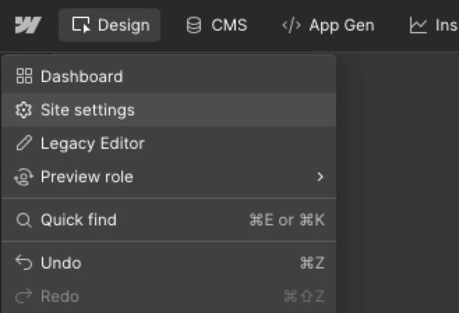
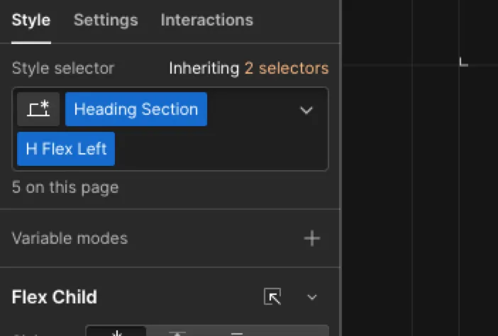
Global Site Settings
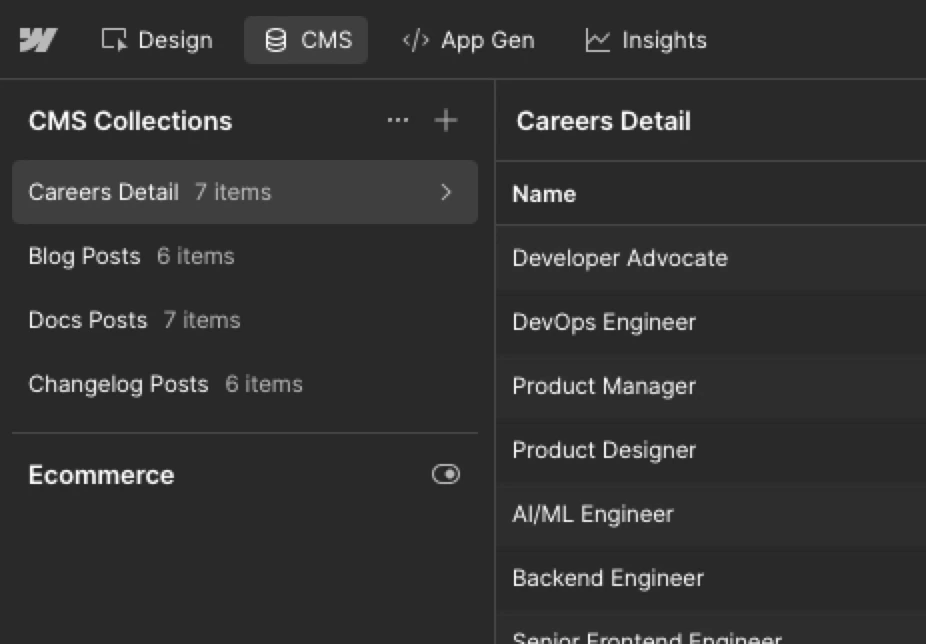
Connecting the CMS
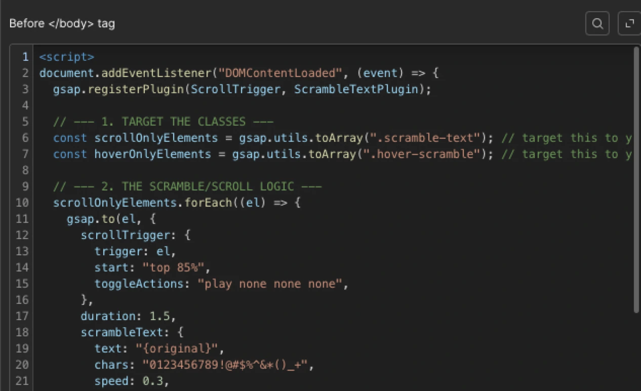
GSAP Custom Code & Scripts
</body> tag, as these power the advanced features.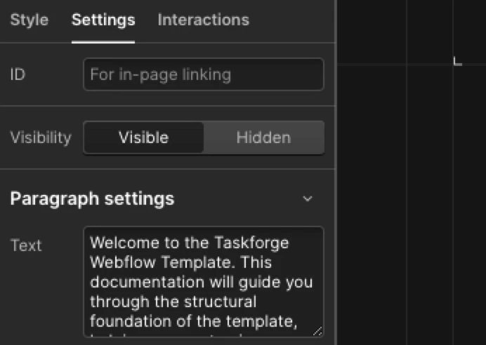
Edit Text Content

Modify Media
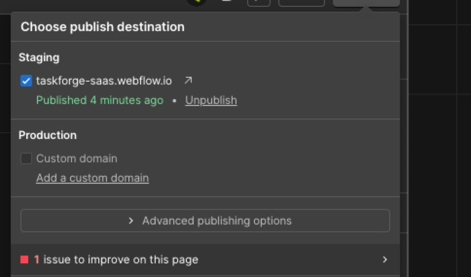
Publishing
.webflow.io staging domain first to test form submissions and animations across different breakpoints.Taskforge is built using Webflow’s native Variables system. This allows you to completely re-theme the dark aesthetic in just a few clicks without manually editing individual elements.

Accessing Variables
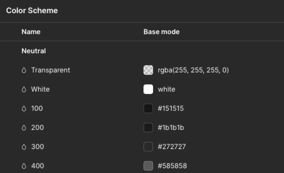
Color System
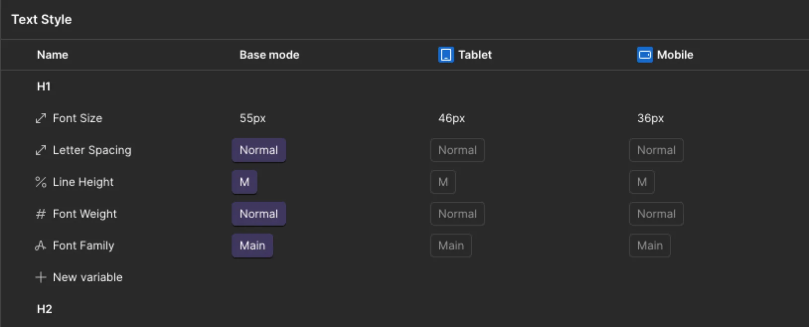
Typography Variables
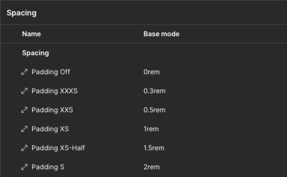
Spacing Variables
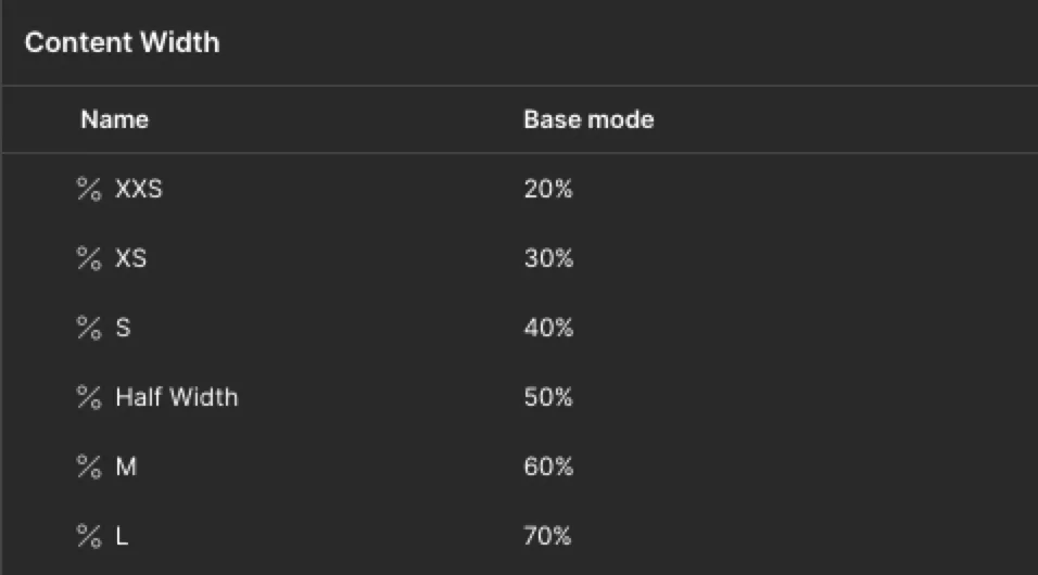
Content Width
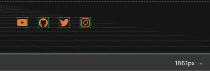
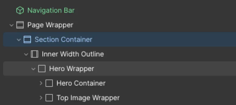
To ensure a consistent and trustworthy layout across more than 25+ pages, we have developed sections and specific components for recurring UI elements.
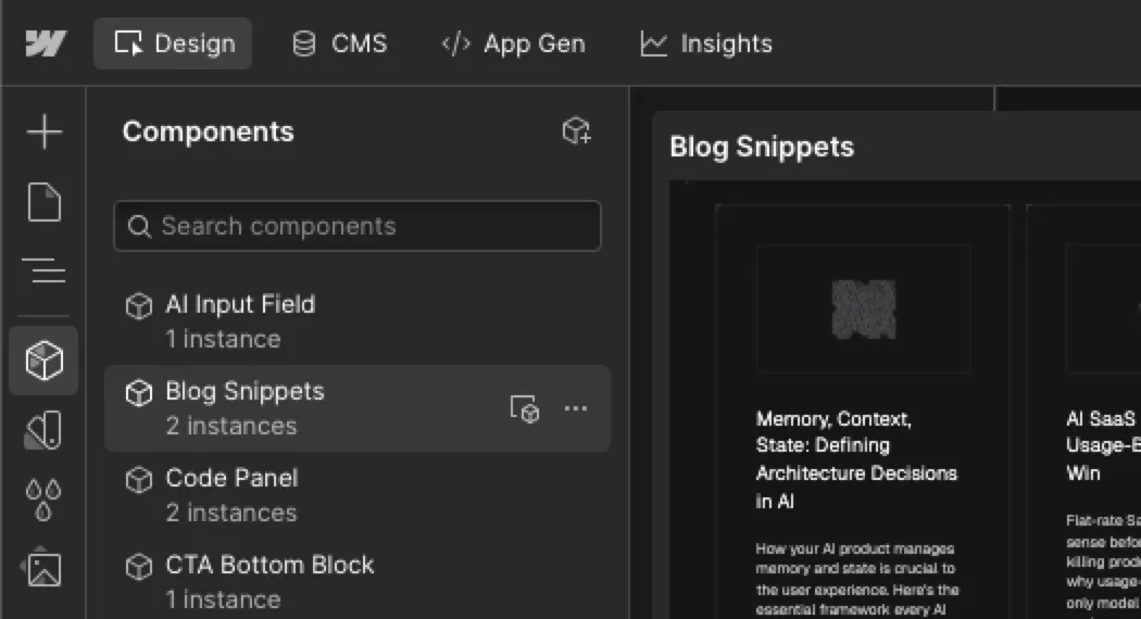
Finding Components
Shift + A). Here you will find Navbars, Footers, Feature Cards, CTA sections, etc.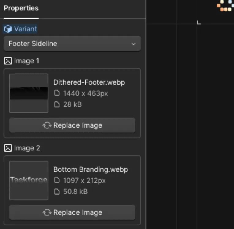
Component Properties
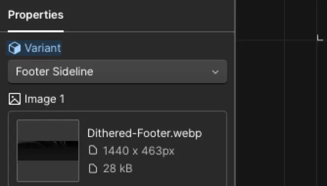
Component Variant
Global vs. Local
Taskforge uses a clean, predictable class naming convention to ensure scalable CSS and prevent styling conflicts.
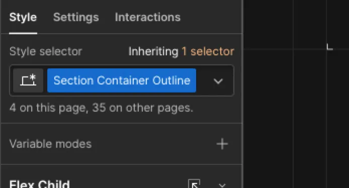
Utility Classes
Combo Classes
Container System
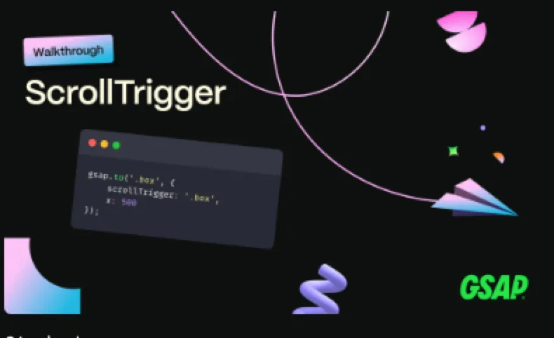
Taskforge includes advanced scroll and text animations powered by GSAP (GreenSock), including <ScrollTrigger> integration. We have using the custom GSAP code so you can control animations without writing JavaScript.
Scramble Text Scroll
Scramble Text Hover
1<script>
2document.addEventListener("DOMContentLoaded", (event) => {
3  gsap.registerPlugin(ScrollTrigger, ScrambleTextPlugin);
4
5  // --- 1. TARGET THE CLASSES ---
6  const scrollOnlyElements = gsap.utils.toArray(".scramble-text"); // target this to your scramble cla
7  const hoverOnlyElements = gsap.utils.toArray(".hover-scramble"); // target this to your hover class
8
9  // --- 2. THE SCRAMBLE/SCROLL LOGIC ---
10  scrollOnlyElements.forEach((el) => {
11    gsap.to(el, {
12      scrollTrigger: {
13        trigger: el,
14        start: "top 85%",
15        toggleActions: "play none none none",
16      },
17      duration: 1.5,
18      scrambleText: {
19        text: "{original}",
20        chars: "0123456789!@#$%^&*()_+",
21        speed: 0.3,
22      }
23    });
24  });
25
26  // --- 3. THE SCRAMBLE HOVER LOGIC ---
27  hoverOnlyElements.forEach((el) => {
28    // Create the animation for this specific element
29    let hoverAnim = gsap.to(el, {
30      duration: 0.8,
31      paused: true,
32      scrambleText: {
33        text: "{original}",
34        chars: "X01@#&%",
35        speed: 0.5,
36      }
37    });
38
39    // Add the "Listener" to trigger the animation on hover
40    el.addEventListener("mouseenter", () => hoverAnim.play(0));
41  });
42});
43</script>
Modifying the Code
Troubleshooting
Need Help?
New to Webflow? No worries! Get started with Webflow University's 101 Course. If you have any questions, please do not hesitate to contact us.


